

Why Skyscrapers Became Glass Boxes

Everything put into the building that is unnecessary, every cubic foot that is used for purely ornamental purposes beyond that needed to express its use and to make it harmonize with others of its class, is a waste — is, to put it in plain English, perverting someone’s money — George Hill, commercial real estate expert, 1904
A skyscraper is a machine that makes the land pay — Cass Gilbert, architect, 1900.
The most common style for skyscrapers in the US (and probably the world) is the glass box — a structural skeleton of steel or concrete, with a skin of non-load bearing curtain wall made of glass and metal (typically aluminum), and without much in the way of decoration or ornament. If you look at the list of tall buildings recently completed in the US, for instance, buildings with glass curtain wall dominate the list; the buildings that don’t have it mostly have exteriors of exposed concrete framing with large glass windows; it provides a similar aesthetic.
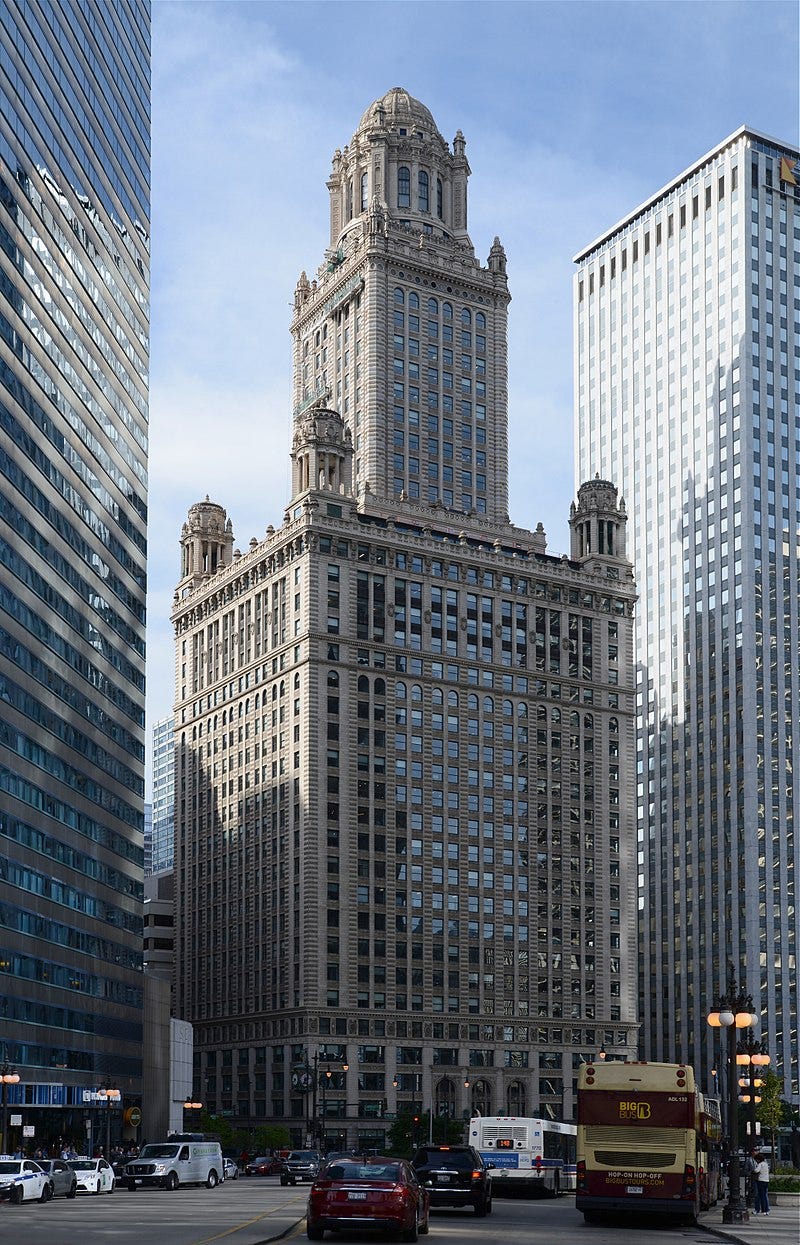
But skyscrapers weren’t always built in this style. If you go back to the early 20th century, you see skyscrapers clad with brick and stone, and much more pattern, detailing, and ornamentation. Buildings like the American Radiator Building (1924), the Jeweler’s Building (1927), the Carbide and Carbon Building (1929), the Chrysler Building (1930), and the General Electric Building (1931) have beautiful stonework, elaborate spires and crowns, and lots of other architectural detail.
Why did this transition happen? A common theory is that it was essentially a plot by modernist architects, who had a particular theory of what made a building “good” — “honest” buildings without excessive decoration or ornament — and who successfully foisted that style on an unwilling public, who preferred the old style. This is more or less the thesis of Tom Wolfe’s From Bauhaus to Our House, a 34,000 word polemic decrying the rise of modern architecture:
Every great law firm in New York moves without a sputter of protest into a glass-box office building with concrete slab floors and seven-foot-ten-inch-high concrete slab ceilings and plasterboard walls and pygmy corridors — and then hires a decorator and gives him a budget of hundreds of thousands of dollars to turn these mean cubes and grids into a horizontal fantasy of a Restoration townhouse. I have seen the carpenters and cabinetmakers and search-and-acquire girls hauling in more cornices, covings, pilasters, carved moldings, and recessed domes, more linenfold paneling, more (fireless) fireplaces with festoons of fruit carved in mahogany on the mantels, more chandeliers, sconces, girandoles, chestnut leather sofas, and chiming clocks than Wren, Inigo Jones, the brothers Adam, Lord Burlington, and the Dilettanti, working in concert, could have dreamed of.
Without a peep they move in! — even though the glass box appalls them all…
And why? They can't tell you. They look up at the barefaced buildings they have bought, those great hulking structures they hate so thoroughly, and they can't figure it out themselves. It makes their heads hurt.
Scott Alexander echoes this theory in his review of the book. Samuel Hughes also gestures at this theory in this Works in Progress piece, where he argues that ornament on buildings didn’t die because it got too expensive, but rather because of the rise of modernism:
In the first half of the twentieth century, Western artistic culture was transformed by a complex family of movements that we call modernism, a trend that extends far beyond architecture into the literature of Joyce and Pound, the painting of Picasso and Matisse, and the music of Schoenberg and Stravinsky. Between the 1920s and the 1950s, modernist approaches to architecture were adopted for virtually all public buildings and many private ones. Most architectural modernists mistrusted ornament and largely excluded it from their designs. The immense and sophisticated industries that had served the architectural aspirations of the nineteenth century withered in full flower. The fascinating and mysterious story of how this happened cannot be told here. But it is a story of cultural choice, not of technological destiny. It was within our collective power to choose differently. It still is.
Changing architectural trends were undoubtedly a factor in the rise of the glass box aesthetic, but this explanation misses a huge part of why this transition happened. Notably, this theory completely omits the role of the real estate developer, who has a greater influence than anyone else in how a building comes together. Skyscrapers are designed by architects, but it’s the developer who conceives of the project, arranges the funding, hires the design team, and ultimately decides what the building will be. To me, the question isn’t “Why did architects embrace modernism? It’s “Why did real estate developers embrace modernism?”
Ultimately, it was economics (or at least perceived economics) that drove developers to embrace this style. Glass curtain wall buildings were cheaper to erect than their masonry predecessors, and they allowed developers to squeeze more rentable space from the same building footprint. Ornate, detailed exteriors were increasingly seen as something tenants didn’t particularly care about, making it harder to justify spending money on them. And once this style had taken hold, rational risk aversion encouraged developers and builders to keep using it.
The role of the real estate developer
In the US, most skyscrapers are built as speculative buildings: they’re built to be rented or sold to someone else. Even large corporate headquarters tend to rent out much of their space to other companies: when Sears built the Sears Tower (now Willis Tower), the company only occupied a little over half the building, and rented out the rest. A skyscraper is thus primarily a business venture: the builder invests money in constructing it, in the hopes of earning a return on that investment by renting it out or selling it. Typically, the builder of a skyscraper will be a real estate developer, someone in the business of acquiring parcels of land and constructing buildings on them.
The basis of a speculative building project is the pro forma: a financial model of the building and its profitability, based on its various projected costs (land, construction costs, financing and so on) compared to the revenues earned from rents. When considering a new building project, the developer will play around with this model — how many apartment units to construct and of what type, whether they should be market rate or luxury, whether any adjacent parcels are needed or not, whether the project should include office space or retail, how much parking is required and where on the site it can fit — until he gets something that seems to work.
The pro forma creates a box that the developer has to work within, and ultimately dictates what sort of building can be built. If costs are too high, or revenues are too low, or the cap rate (net income divided by value of the building) isn’t what it needs to be, then the developer won’t be able to raise the funds from investors to get the building built. The form and function of the building is thus a reflection of what the developer thinks is likely to be profitable. As Jerry Adler notes in High Rise, a chronicle of the construction of a New York skyscraper:
…What [is] most distinctively American about the skyscraper is its purpose, which is to make money. A building, if it is successful, takes on a kind of teleological necessity once it is built, as if no other possible building could have been contemplated in that particular location. We see the arrangement of shapes the architects refer to as the massing, the heart-stopping shimmer in the reflections of the clouds as the wind sucks at the black glass of the windows, the checkerboards of granite on the lobby floor, and to us that is the self-evident end and purpose of all that vast labor. But properly regarded, the physical building is merely the three-dimensional projection of a set of documents known as the pro forma, the calculations that demonstrate how a given piece of real estate can make money. Thus architect, engineer, ironworker all dance to the tune called by the developer.
Of course, for better or for worse, the developer can’t simply build anything that he wants. The developer’s pro forma-shaped-box is constrained by local building rules and regulations: zoning rules that dictate allowable building heights and floor area ratios (the ratio of building floor space to overall land area), code requirements that determine what sort of building systems need to be used (and thus how much the building costs to build), aesthetic requirements implemented by local planning commissions, feedback from design review boards and local residents, and so on.

These constraints can have very large impacts on the size and shape of buildings: the distinctive layer-cake style of early 20th century New York skyscrapers, for instance, was due to zoning rules that required setbacks to prevent buildings from occupying the entirety of their sites. In other cases, securing local approval is so difficult that it ultimately dictates the exterior form of the building, as noted by one Chicago developer in How Real Estate Developers Think:
“…The developer spends a lot of money designing this fancy picture or model,’’ says Emmerman, ‘‘so that they can take it to the alderman, councilman, or mayor, and they either fall in love with it or they bastardize it first and then fall in love with it.’’ Even then, elected politicians will not promote a project until the broader community has seen it and come out in support of it — or at least not come out in complete opposition to it — so the next step is to seek input from the neighbors. ‘‘So then you spend months dealing with the neighborhood and ‘can you make it shorter, can you put the parking underground, can you put in flower boxes,’ and still, we have not talked about how this building functions.’’ By the time the developer commits to proceeding with the detailed design, after many months of promoting the architect’s rendering or model, the image of the building’s exterior shell has become fixed in the minds of the public.
“…Once you have figured out the typical floor plate based on all of these constraints,’’ says Emmerman, ‘‘you try to fit the units into the space that is left over.’’
It’s the developers job to navigate this mass of constraints, and to come up with a plan for a building that will be compelling to renters, acceptable to local residents and building authorities, and earn an acceptable return. The developer is highly incentivized to get this correct: real estate is a competitive market, and a new building project must compete with many other buildings on the market. Developers will thus typically pay very close attention to the local real estate market: growth rates, population demographics, what sort of projects are successful and what aren’t, what features are compelling to tenants, and so on. In some cases developers will go so far as to bring their sales staff to early stage design meetings, and have them weigh in on the design of the building itself, to ensure they’re building something that buyers want and staff can sell.
Developers and architects
To design the building, the developer hires an architect, who will lead the design effort and manage the design team (which includes specialties like structural engineers, mechanical engineers, and so on). The architect is the developer’s agent, and is duty-bound by professional ethics to act in their interest.
Which is not to say that the architect simply does exactly what the developer wants. An architect is hired for their professional expertise on building design, including a building’s aesthetics. A good design that not only meets the developer’s programmatic requirements (number of units, amount of rentable space) but is aesthetically pleasing is one of the services the architect is providing. If an architect advocates for some particular design choice — a finish material, a building shape, a decorative feature — the developer will take that seriously. They hired the architect in part for their aesthetic taste, after all.
But this sort of advocacy works only to a point. An architect typically can’t just go in whatever aesthetic direction they want, with the developer forced to follow along. For one, they can’t stray outside the box built by the developer’s pro forma and by what will be approved by the local authorities. This limits what sort of options an architect has to choose from: they can’t simply pick a facade material that’s twice as expensive, or a building shape that doesn’t have sufficient square footage, just because they like the look of it.
For another, architecture is a very competitive field (there are around 120,000 registered architects in the US), and an architect who makes unreasonable demands or can’t keep projects within budget is an architect who will have a hard time getting future work. Often a developer will solicit proposals from several design teams, choosing the team they like the best or the one that has the lowest fee. Developers tend to return to architects whom they work well with, who understand that a building is ultimately a question of economics, who know what sort of things are reasonable to ask for and what can’t be accommodated. Most buildings aren’t designed by starchitects like Frank Gehry or Zaha Hadid who are trying to create unique works of art, but by client-friendly architects who will hew to the constraints they’re given and try to deliver a reasonably-priced building that meets the design requirements.
One such firm was Emery Roth and Sons, founded by Emery Roth in 1903. While not a household name, Roth and Sons’ influence on the New York skyline was enormous. Between 1950 and 1970, the firm designed 70 office buildings, accounting “for half the [New York] office acreage created since the war”:
…Four consecutive blockfronts on the west side of Park Avenue between Forty-eighth and Fifty-second streets were redeveloped according to the plans of Emery Roth and Sons. These skyscrapers were built to house some of America’s mightiest corporations, and above their portals were emblazoned the names of Bankers Trust Company, Colgate-Palmolive, International Telephone and Telegraph and Manufacturers Hanover Trust. The new, glittering, glass-walled faces of Park Avenue, as well as of Madison and Third Avenues, were almost entirely Roth-fashioned. As testament to this fact, a new word was coined — ”Rothscrapers” — to denote the glass and metal towers designed in the Roths’ modern idiom. They had such a dramatic effect on the New York skyline that Ada Louise Huxtable, former architecture critic of the New York Times, saw them “as responsible for the face of modern New York as Sixtus V was for baroque Rome.”
Emery Roth and Sons’ success was not because of their aesthetics – their designs were highly criticized by architecture critics. (Frank Lloyd Wright allegedly refused to drive down the streets that were dominated by Rothscrapers.) It was due to the simple fact that they had a reputation for delivering low-cost buildings with very large amounts of rentable space. In his book on Emery Roth, Steven Ruttenbaum notes that “Like no other architects in the post-war era, the Roths developed the most economical method to construct tall office buildings”:
What builders paid for, the Roths believed, was not art but utility —maximum rentable space, high-speed elevators, flexibility of plan and comfortable interior climate… One builder stated, “The Roths give you maximum utility without losing an inch of rentable space.” Another observer even went so far as to describe the Roth operation as the “business of designing business buildings for business men who put up business buildings for other business men.”
Meredith Clausen similarly describes the Roth’s in her history of the Pan Am building:
A large measure of the firm’s success was due, as Richard Roth was later bluntly to explain in his essay, “High-Rise Down to Earth,” to their aim “not to create masterpieces” but to provide buildings that worked efficiently and economically for their clients: buildings, that is, that met the programmatic requirements of the client and insured a profit.

These sorts of developer friendly architects abound. In Chicago, architect slash developer James Loewenberg was similarly infamous for filling the skyline with aesthetically forgettable but very profitable buildings. In the early 20th century, Shreve and Lamb (later Shreve, Lamb and Harmon), the firm which designed the Empire State Building, was likewise known for being practical, unsentimental, and keeping their eye on the bottom line, as John Tauranac notes in his history of the Empire State Building:
"The day that an architect could sit before his drawing board and make pretty sketches of decidedly uneconomic monuments to himself has gone," said Lamb. "His scorn of things 'practical' has been replaced by an intense earnestness to make practical necessities the armature upon which he molds the form of his idea…he must know how to plan his building so that it will 'work' economically and produce the revenue for which his clients have made their investment."
With the design of the Empire State Building itself, Lamb would state that “whatever ‘style’ it may be is the result of a logical and simple answer to the problems set by the economic and technical demands of this unprecedented program.”
Developers, especially those successful enough to be able to finance skyscraper construction, are also savvy enough to understand the architecture market: what firms are best at what sort of work, which architects are easy to work with and which aren’t, and what they’re getting when they sign on with one. If a high-profile architect is hired, it’s because the developer thinks that their style, or the cachet of their name, will bring value to the project. But even famous and opinionated architects aren’t necessarily given carte blanche to design buildings however they like.
An example of this is 1540 Broadway, the New York skyscraper whose design and construction was chronicled by the book High Rise. The developer hired Skidmore, Owings and Merrill (SOM) to create the design. SOM was (and is) one of the most famous architectural firms in the world, responsible for designing many of the world’s tallest buildings. At the time, SOM was notable for having fervently embraced architectural modernism, so much so that the three cofounders were sometimes called “the three blind Mies,” after modernism founder Mies van der Rohe.
But impeccable architectural credentials and strong aesthetic preferences didn’t mean that SOM was in the driver’s seat. The developer, Bruce Eichner, required constant redesigns to get the building where it needed to be finance-wise. Major architectural features were constantly removed or reworked: for instance, SOM wanted to have three-foot-deep recesses in the building as a major architectural feature, which would be supported by an expensive Vierendeel truss. But this was rejected as too expensive, and SOM was ultimately forced to accept much shallower, nine-inch recesses and a more conventional steel moment frame. The building’s shape was changed to remove articulation and reduce the amount of expensive cladding required. Interior finishes were changed based on feedback Eichner got from a real estate broker on what tenants wanted.
This sort of client feedback is common with high-profile architects. Minoru Yamasaki was the architect who designed the World Trade Center, but his feet were held to the fire the entire time by his client, the Port Authority. From City in the Sky:
Tozzoli also weighed in. The trade center, he said, was going to be beautiful. That was why Yamasaki had been hired. But this was not going to be some esoteric architectural exercise. The commanding force here — besides the bottom line — was going to be “the Program,” the nonnegotiable set of specifications for the job. It totaled 10 million square feet of net rentable space. The message was eminently clear. This was not going to be a project in which Yamasaki came up with a design and then presented the results to an awed client. He was facing the prospect of an endless interrogation and negotiating and bickering with the Port Authority. His plans would be criticized at every step and changed if they did not meet the test of practicality as defined by Tozzoli and Levy and the others. And it would soon be especially obvious that there was no escaping Levy, a man who could be so nasty he could, and often would, make Yamasaki quiver silently with humiliation or anger. Levy was going to be Tozzoli’s whip hand on the trade center. The cursing, tantrum-prone Levy was going to make sure that the little group of architects in the Detroit suburbs designed the kind of buildings that the Port Authority damn well wanted.
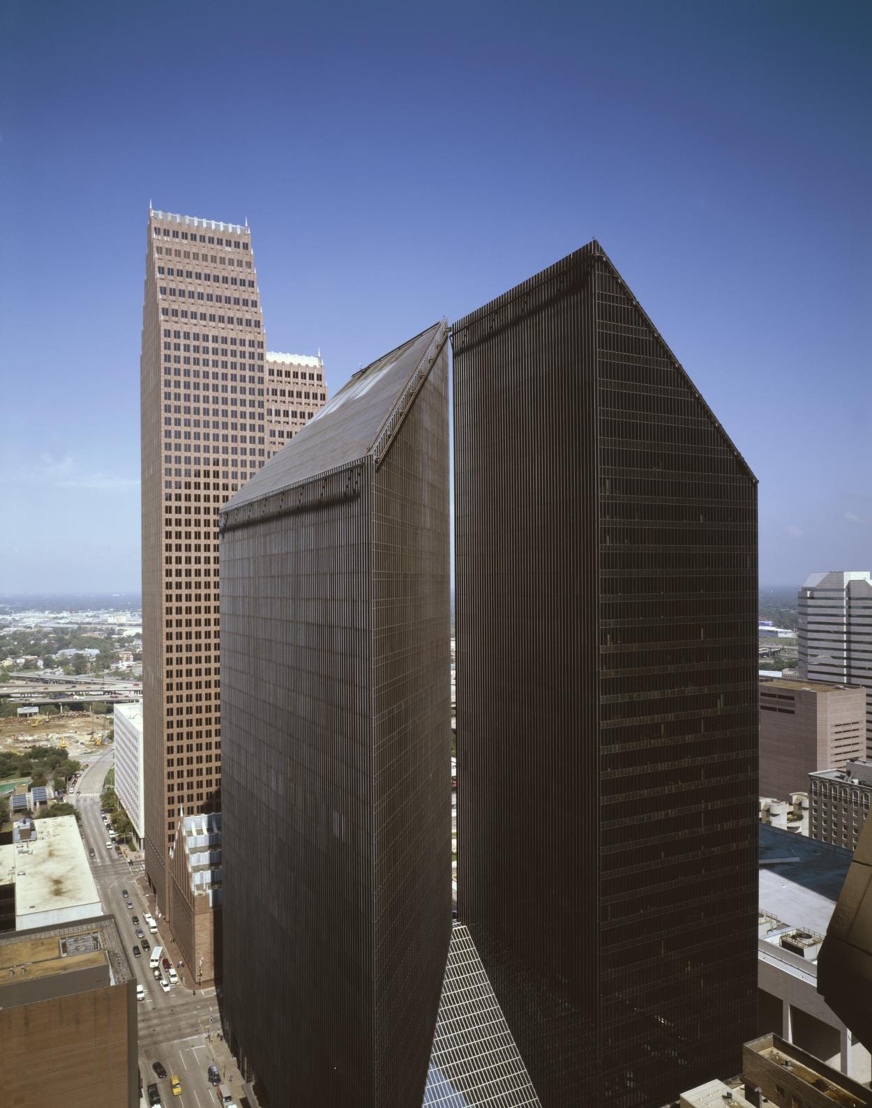
Similarly, famous modern architect Philip Johnson designed Pennzoil Place, which won many accolades for its design (it was described as the “Building of the Decade” by architecture critic Ada Louise Huxtable), but its design was ultimately the result of feedback from developer Gerald Hines and Pennzoil chairman Hugh Liedtke1. From Raising the Bar, a biography of Gerald Hines:
The first thing Hugh Liedtke said was, “I don’t want one of those upturned cigar boxes!” said Burgee. “He said, ‘I won’t have any of that’... Hugh started saying “I want something that when people see it, they say, ‘That’s Pennzoil.’ ...Then he said to me, ‘I hate aluminum, can’t be aluminum, these damn aluminum and glass and mirrored glass buildings.’”
…Johnson and Burgee’s initial ideas were unsuccessful — either too conventional or too similar to the Seagram Building that Johnson had designed in New York. Both Hines and Liedtke soundly rejected all of their ideas. Then Hines, without realizing it, came up with the answer. “Gerry said, ‘we’ve gotta have two tenants,’ said Burgee… “And Philip Johnson said, ‘Well, why not two buildings?’”
“Hugh said he didn’t want an upturned cigar box,” Burgee said. “Well, except for the little cut in the building, the buildings we’d designed were cigar boxes from one side. So we said, ‘We’ve got to do something with the top so it isn’t just a flat, cut-off cigar box.’” So they cut the top off of each building at an angle, leaving two dramatic pointed peaks.
“I remember showing the idea to Gerry for the first time, and he said, ‘Oh, no, no, that’ll never do,’” Burgee said. “‘A point on a building?’ he said. ‘You can’t rent that point.’ ...”And he said, ‘we have to take it to Hugh and see what he thinks,’ said Burgee. “But make the points removable,’ So we made the model so that the tops pulled off so that Hugh could see the building flat and also with points.”
“[Liedtke] saw it, and he was quiet, and he thought about it and said, ‘I like it,’” said Burgee. Then the architects showed Liedtke the model without the points. So we took the tops off, and Gerry said, “Mr. Liedtke, this is going to cost X hundreds of thousands of dollars’ or something. Hugh didn’t answer. He looked at us, Philip and me, and he said, ‘Put ‘em back,’ and we put ‘em back on. And he said, ‘That’s it’ and left. Those points never came off again, and that was the end of the meeting.”
More generally, developers may or may not have strong aesthetic preferences (some care deeply, some not at all), but either way they tend to exercise a firm hand in the design process, putting money where it's useful and cutting it out where its not, and will often be very opinionated about what will work for a given project, based on the market and what tenants are believed to want.
Why developers chose glass curtain walls
So why did developers embrace the glass box aesthetic? Unsurprisingly, it comes down to economics.
Prior to World War II, most skyscrapers had walls of stone or masonry. This was partly a holdover from the days when buildings were built with load-bearing exterior walls. The development of the steel frame at the end of the 19th century allowed buildings with non-load-bearing exterior walls, but codes were slower to change than technology, and still often required a thick layer of stone, brick, or terra cotta on the exterior. But by the late 1940s and early 1950s, building codes were beginning to omit these requirements.
As codes were changing, other technological developments were making thin exterior walls made of metal and glass practical. Air conditioning was becoming common, making it possible to cool buildings with large expanses of windows that might otherwise get too hot in the summer. Aluminum production had risen enormously during the war due to the needs of the aircraft industry, driving down its cost, and after the war manufacturers hunted for new markets that could absorb some of this capacity. Aluminum building cladding and window framing soon became an important new market. In 1948, aluminum-framed windows were just 5% of the market: by 1956, that had risen to 20%. The new headquarters of aluminum manufacturer Alcoa, built in 1952, was described as “one big showcase of aluminum,” with aluminum “walls, roofs, ceilings, doors, hardware, baseboards” and much more. From Tom Leslie’s history of Chicago skycrapers:
The building’s “most important feature…from the standpoint of future large-volume use of aluminum in skyscrapers,” though, was its cladding system of stamped aluminum panels with integral windows, each just an eighth of an inch thick and factory-assembled, avoiding complex assembly on-site.
Glass, too, was getting cheaper. In the 1950s, British glass manufacturer Pilkington invented the float glass process, which produced glass by casting it on a pool of molten tin. The resulting surface was nearly defect-free, eliminating the costly grinding process flat glass had previously required and greatly reducing the cost of high-quality window glass. Between the late 1950s and the 2010s the cost of flat glass fell by 75% in inflation-adjusted terms.
These developments made it possible to replace thick, heavy walls of stone and brick with thin, light curtain walls made of glass and aluminum. And while this style of construction was indeed championed by modernist architects, it also had decisive advantages from a real estate developer’s perspective.
The most obvious was cost. A glass and metal curtain wall wasn’t necessarily all that much cheaper than one made of brick in terms of the materials themselves, but it was much thinner and lighter. Its thinness meant that for two equally sized floor plates, the curtain wall framed one would have more rentable square feet than the stone or brick one. This more than made up for the fact that the thin curtain walls had worse insulation and were more expensive to heat and cool than masonry walls.


Similarly, the fact that a glass and metal curtain wall was so light meant that less structural framing was required to support it. Beams and columns could be made thinner, foundation sizes reduced. Not only did this reduce the cost of the building itself, but it reduced the cost of constructing it: all else being equal, a lighter structure is easier and cheaper to erect. Curtain wall could also be produced as large, prefabricated panels, allowing for very rapid installation on-site and eliminating expensive craft trades like masons.2 With curtain wall, a building no longer needed scaffolding around the edge of the building for masons to work on: the curtain wall panels could simply be swung into place. From The Ecologies of the Building Envelope:
Facades for office towers composed of prefabricated panels could be literally installed within days, and were done so with fanfare to incite a growing clientele… Emery Roth and Sons’ 1954 National Distillers Building, at 99 Park Avenue, featured a prefabricated curtain wall “comprising 1800 two-story-high panels.” It was erected in “six-and-a-half working days, a remarkable feat compared with the eight weeks or more that a conventional masonry facade would have required.” This building was originally specified to be clad in masonry. However, the executives of the Tishman realty and Construction Company “had been impressed with the facade of [Alcoa’s] Pittsburgh headquarters” and decided to switch to aluminum. In the same year, Emery Roth and Sons was commissioned to clad 460 Park Avenue, and astonishingly did so in a single day.
The cost advantages of curtain wall still exist today: if you use RSMeans’ pricing tool on a high-rise apartment building, curtain wall will come out cheaper than either precast concrete cladding or brick (though it will be more expensive than the even cheaper EIFS).
There were also functional advantages of curtain wall that made it attractive to tenants. Large expanses of glass let in lots of natural light and maximized the amount of floor space that had nice views, two things that tenants valued highly (and were willing to pay for). Continuous expanses of glass also made it very easy to rearrange interior office partitions, as Richard Roth noted in an article in Progressive Architecture:
Architecturally strong and impressive as the Radio City masses may be, they do not, with their window-pier-window design, allow for this interior planning flexibility. Therefore — the new exterior design to suit interior plan spacing. It is as simple as that! Window-mullion-window-mullion (445 Park Avenue — Kahn and Jacobs): strip building with continuous windows and continuous masonry spandrels (575 Madison Avenue — Emery Roth and Sons): metal and glass “skin” buildings (Lever House — Skidmore Owings and Merrill): and the metal and metal with the windows losing their accent in the dominance of the metal (99 Park Avenue — Emery Roth and Sons).
Developers and ornamentation
But the popularity of curtain wall is only half of what needs to be explained. A preference for glass and metal cladding, wouldn’t, on its own, eliminate ornament and decoration on buildings. Ornamentation and glass curtain wall aren’t mutually exclusive.
The elimination of ornament also comes down to economics. As we noted earlier, developers place a great deal of weight on what tenants want, and what they’re willing to pay for. And the reality is that while tenants care a great deal about what the inside of the building is like, they pay much less attention to the exterior of the building. Some developers, such as James Loewenberg, state this explicitly. From How Real Estate Developers Think:
“The person who looks to buy or rent a unit in a high-rise,” says Loewenberg, “only cares about three things: the location of the building, the layout of their unit, and the view from their unit. They don’t care as much about the physical appearance of the building and it is my contention that they never really look above the third floor…”
Loewenberg recalls being roundly criticized by another critic for a project with a parking garage finished in exposed concrete. “He asked me, ‘Well, why are you putting marble thresholds in the apartments and why didn’t you spend the money on better finishes for your concrete garage?’ I guess it was heresy when I said, ‘Because people don’t care about what a garage looks like and in fact they would rather see a marble or granite countertop than a magnificent exterior on a garage.’ That critic,” says Loewenberg, “was trained as an architect, so he looks at the outside of the building and thinks that no shortcuts should be taken and that you should only do beautiful architecture. I, on the other hand, would rather put my money where it counts, and I happen to know that it is the finishes that sell.”
Other developers aren’t quite so explicit that they don’t care about exteriors, but nevertheless echo these sentiments. In his book Powerhouse Principles, developer Jorge Perez emphasizes that as a developer you should “spend your money on work that can be seen”:
Obviously the building has to meet standards and codes and everything else, but what sells it is bathrooms, kitchens, flooring, landscaping, and amenities, those things that are highly visible and that people consistently note as higher priorities… We have found, particularly in the for-sale product, that changes you made to bathrooms and kitchens were of extreme importance. People will pay you an additional amount of money for those expenditures. If I spent $2 and I did it correctly, they would pay me $4 for the more beautiful kitchen.
Perez cares a great deal about the design of his projects, but his focus is on things where people spend their time: in their units, in the amenities, in the lobby, and so on. The interior designers he uses merit multiple mentions in his book. And while he also mentions a few high-end architects he’s worked with (Arquitectonica, Robert Stern), his buildings nevertheless tend to end up as basic boxes. From How Real Estate Developers Think:
While [Perez] hires award-winning architects to create his building’s exteriors, like Jim Loewenberg he also knows that it is where people live that matters, and that is why he focuses on the interior design of the public areas and the amenities.
If exterior details and ornamentation are not something a tenant is willing to pay for, they’re not something a developer is inclined to spend money on. And simpler, less ornamented buildings are cheaper to build. Ornaments and details cost money. Articulation and interesting facade shapes increase the amount of (expensive) exterior cladding without a corresponding increase in rentable square footage, and add joints and connections that become potential points of failure.
When a developer does add ornament, it’s often in relatively limited ways in an attempt to get the most bang for their buck, ways that don’t change the size or shape of the building: making the windows a slightly different color, adding luxurious touches to one small, highly visible corner of the building, and so on. One developer described this process to me as “applying doilies.”
An example of this is Aqua Tower in Chicago, designed and built by James Loewenberg. Aqua won awards for its design, which features an undulating shape due to its curved, differently-sized balconies that extend beyond the edge of the building.

Loewenberg notes that this design was incredibly simple and inexpensive to create:
‘‘it is the simplest box we have ever built, and in fact, the hardest part of the job was convincing the contractors that other than the cost of the materials to extend the balcony slabs this would be no different from building the basic box.’’ Ultimately, Loewenberg was successful: ‘‘I finally browbeat the contractors enough to talk them into it.’’
…In the end, the only additional costs incurred to realize such a unique exterior design were the material costs of the extra concrete at the extended balconies and the labor costs of the two workers installing the edge form on each floor… “The total cost for all of it was probably a couple of hundred thousand dollars, which is nothing on a building of this size.’’ Aqua is eighty-two stories and contains nearly two million square feet of hotel space, apartments, and condominiums, and its total cost was about $500 million, so a couple of hundred thousand dollars to get that magnificent effect truly was peanuts.
The financialization of architecture
Of course, this desire to eliminate ornament which doesn’t contribute to the bottom line didn’t emerge suddenly following World War II: it had been a trend for decades prior to that. In his history of the Empire State Building, John Tauranac notes that in the early 20th century, real estate investors were becoming less and less inclined to fund “spurious” ornamentation that wouldn’t yield greater profits. This paragraph sounds like it’s describing modernist glass skyscrapers of the 1950s, but it's actually about Art Deco skyscrapers of the 1920s:
…The demands of tenants probably more than the desire of avant-garde architects was responsible for the popularity of the modern style, of this functionalism. Tenants wanted the light and space that modern buildings afforded, and were willing to accept modern design to achieve their needs. Suddenly designs that only a few years before might have seemed radical had won a more secure place. It wasn’t that ornament cost so much more, but even if the syndicate had been willing to pay for the little extra for it, there were more fingers in the fiscal pie than those of the four primary underwriters. The Metropolitan Life Insurance Company was a conservative investor whose goal, naturally enough, was to secure the greatest possible return upon invested capital. Underwriters were willing to tie up their investment over a period of many years, but less willing to pay for what was deemed redundant decoration. Hood told of one banker who rejected a design that was all gussied up. When the architect returned with something more practical, the revised plan was financed. Hood said that architects and developers were catching on to the fact that mortgage money would more readily go to office buildings in the modern, functionalist style than those designed in a more traditional style, a trend that would continue…
This trend towards “financialization,” of viewing a building increasingly in economic terms and only adding features that could be financially justified, continued over the course of the 20th century. Following World War II, developers embraced modernism because it provided an excuse to construct buildings less expensively, notes Steven Ruttenbaum:
For builders, it was getting increasingly more expensive to erect commercial structures and to hire craftsmen to decorate them with special flourishes. It is not that ornament became prohibitively expensive, it merely entailed more of an initial investment than builders were prepared to risk. They were, of course, in business to make money, not to “squander” it on things that had no relation to their buildings’ utility. And after World War II, it became increasingly easy for them to accept austere facades in light of the growing acceptance of the International Style. In the late thirties, the great European masters of modernism arrived in America as refugees from the Nazis, and they were fortunate in securing some of the nation’s most prestigious academic positions. It was only a short time until the economical style they espoused became accepted by speculative builders.
In Skyscraper Dreams, Tom Schachtman likewise notes the bland designs of Emery Roth and Sons were in large part due to client feedback:
…when they did try flights with more fancy, as often as no Richard and Julian were asked to scale back the more extravagant touches. Years later, when asked why he did not design more interesting buildings, Richard was heard to mutter that if he’d had more innovative clients he’d have produced more innovative designs. This was more humble than necessary: the designs were better than the critics suggested. And perhaps the forelock-tugging inherent in the statement was subtly encouraged by the Roths’ developer clients, to reinforce awareness of the minor place of the architect in the builder’s grand scheme. In a period in which beauty was no longer perceived a great sales tool, artistry in buildings was not assiduously cultivated.
Similarly, in his analysis of the architectural profession in the 1980s, Robert Gutman notes that architects were increasingly pressured by clients to economically justify the aesthetic elements of their designs, in part because clients were increasingly organizations rather than individuals:
The most significant characteristic of the organization clients is their disposition to view architectural production from purely a rational and instrumental perspective. This means that the organization clients regard buildings as capital assets, which should be managed like every other potential source of productivity, income, and profit… All features of buildings come to be judged by these criteria, including the esthetic dimension, which traditionally was considered as outside of the realm of this system of calculation.
The prevalence of the instrumental mentality in the building and design process represents the latest stage in the historical transformation of the architect-patron relationship, a process that began in the middle of the nineteenth century.
Even non-profits aren’t immune from this sort of pressure:
A fact that often surprises architects when they discover it for the first time is that the instrumental view of architecture has also taken over non-profit institutions, which formerly took a more casual view of their physical plant and regarded buildings primarily as works of architectural art. This new mentality regarding buildings is especially noticeable among university and cultural organizations in the non-profit sector. With the expansion in the number of universities, museums, symphony halls, and theaters, competition for funding is rapidly becoming more intense. Curators, presidents, and other managers of these institutions are under increasing pressure to justify their building needs in terms similar to those that apply to the profit sector.
This tendency to omit decoration that buyers don’t seem to value isn’t limited to modernist, International Style skyscrapers. Consider, for instance, this single family home, which is fairly representative of new home construction in the US.
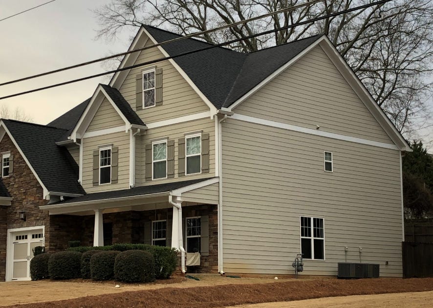
This home obviously isn’t anything resembling “modern” architecture, and the front of the house has a great deal of ornamentation. Stone cladding, decorative shutters, faux lintels over the windows, and so on. On the sides, however, there’s virtually nothing: no stone cladding, no decoration on the windows, almost no ornament whatsoever. (In many houses, even the decorative muntins on the windows will be omitted on the sides and back of the house.) Builders apparently believe that buyers don’t particularly value ornament other than on the front of the house, and so they omit it everywhere else. And since it’s very rare for owners to go and add any sort of ornament back in, it seems like the builders are correct.
Part of this is a problem of legibility. For some building features, like granite countertops, stainless steel appliances, or washer/dryer hookups, developers can quantify how much they’ll contribute to additional rents, and how much it's worth spending on them. But for exterior ornamentation, or simply an attractive exterior design, it’s much more difficult to quantify the benefits of it. If it can’t be included as an element in a financial model of the building, it's hard for a developer to justify spending money on it.
More generally, there seems to be a certain amount of market inefficiency in the construction of new buildings, for reasons I don’t quite understand. Some developers have told me that the value of good design is the sort of thing that accrues over the long term. A developer putting up a building and then holding on to it might be able to see that value (though convincing outside investors is another story), but for a merchant builder that’s going to turn around and sell it, it won’t be reflected in the price they’ll be able to get for it.
Developers and risk aversion
For these reasons, the unadorned glass box aesthetic became popular. And once a construction system becomes popular, numerous forces conspire to keep it in place. For one, a huge number of decisions in real estate are based on “comparables”: comparing your building to a similar building targeting a similar part of the market. This ultimately pushes new buildings to be similar to what’s already being built. Investors are risk-averse, and don’t want to fund a project that’s too different from what already exists and what the market expects. Developers don’t want to make risky design decisions, because bold choices are perceived to be polarizing, and are more likely to drive away tenants than they are to attract them. And for a developer, the downside of a project going poorly is much greater than a project doing exceptionally well, which incentivizes going with the tried and true. The more common a style becomes, the riskier it is for a developer or investor to deviate from it.
A similar logic drives architectural and engineering decisions. Architects and engineers want to use systems they’re familiar with and have used before: they already have the details and calculations for them (saving them time and effort), and the systems have been vetted and demonstrated to work. An architect who specifies a glass curtain wall that he’s used many times before can be confident that the system will perform as expected, that the waterproofing will work as designed, and so on. If instead he specifies a novel system, he’s both making more work for himself and taking a major risk in doing so.
On the construction side, contractors similarly prefer to use the tried and true rather than something novel with significant downside risk. On Aqua Tower, the contractor was extremely reluctant to build the novel curved balconies, not because they were expensive but because they were different. And if a construction system stops being used, the skilled labor that knows how to install it eventually disappears from the labor pool. Architects and developers have told me that one hurdle for specifying ornate masonry or stonework is that in many cases there’s a really limited number of skilled practitioners that can do that sort of high-quality work. It’s much easier, cheaper, and less risky for a developer to simply use the systems that local contractors are already familiar with.
Is the glass box a market failure?
So ultimately, the glass box aesthetic became popular not only because modernist architects liked it, but because it made buildings cheaper to build, and because developers gradually realized that ornate, highly-detailed exteriors weren’t particularly compelling to renters or to their investors. And once that aesthetic was in place, risk aversion and cost considerations kept it in place.
Of course, none of this means that it’s impossible to build anything other than a plain glass skyscraper. Many developers care deeply about good exterior design, believe more classical design adds value and makes their project more competitive, and get funding to build those sorts of projects. Architects like Robert Stern and Peter Pennoyer have designed and built several skyscrapers with brick and stone cladding, and interesting detailing. But these sorts of efforts are to some extent swimming against the current, which nudges developers towards a simpler, more modernist aesthetic.
One could argue that there’s a sort of market failure at work here: because architecture is ultimately funded by the people who occupy a building but viewed by people outside of it, there are externalities (in the form of benefits of attractive exteriors) that aren’t being appropriately priced in. An “efficient” market for architecture, which used some sort of mechanism to properly weigh the preferences of everyone who has to look at the building, might be expected to produce more beautiful buildings (for whatever your definition of beautiful is).
Unfortunately for proponents of this theory, we already have such a mechanism: as discussed above, building design is heavily influenced by design review boards, planning commissions, and other forms of community input. Our current system bends over backwards to consider local preferences and give weight to these sorts of externalities. This doesn’t seem to have had much of an impact on how “beautiful” buildings are, or the dominance of the glass box aesthetic: all it does is make them harder to build.
The Pennzoil cladding is in fact aluminum, but Johnson and Burgee used a color that didn’t resemble aluminum at all. When presented to Liedtke, he simply said “That’s not aluminum, aluminum doesn’t look like that” and let them proceed with it.
A cousin of curtain wall is window wall: while curtain wall creates a continuous facade on the outside of the building, window wall panels extend between floors, attaching to the slab on the top and bottom. Aesthetics-wise, window wall is very similar to curtain wall, so we’ll lump it in with curtain wall here.
Very nice article, but I think it’s wrong to imply that most people would have always viewed glass covered ceilings as less aesthetically pleasing. While nowadays all-glass buildings are so commonplace that they’re boring to look at, I’m old enough to remember when all glass buildings were still in the minority in Midtown Manhattan and more eye-catching. This is when I was a child, and while my tastes have changed and may not have reflected those of the average adult at the time, the all-glass buildings definitely had a “cool factor” that the old masonry building simply did not. They seemed more modern, clean, and a better fit for our age. I imagine more people felt better about working in one than they did in older buildings with smaller windows that looked like an office their grandfather would have worked in. In other words, I tend to believe the rise of all glass buildings in part reflected aesthetic preferences as well as costs.
The regulatory environment is mostly a Veto-ocracy. As such, you have to design around the most bland preferences imaginable. This is why “public comment” usually results in something that checks a lot of boxes but is otherwise boring and inoffensive to anyone.
Bland glass boxes seem to be less offensive to people than ornate or oddly shaped edifices, so that’s what we are going to get as long as the veto power remains the most important factor.