

Do Commodities Get Cheaper Over Time?
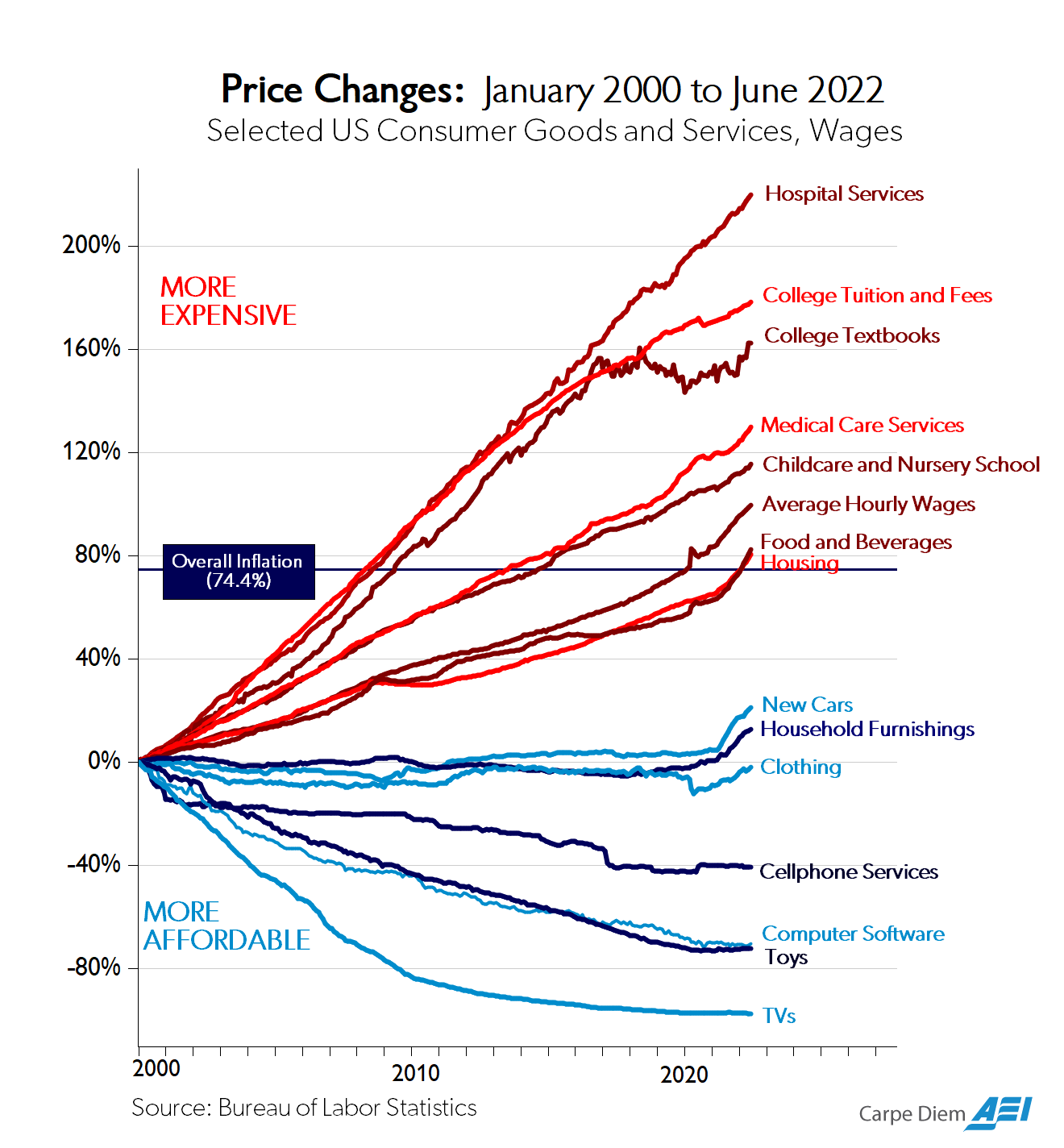
This American Enterprise Institute chart, which breaks down price changes for different types of goods and services in the consumer price index, has by now become very widely known. A high-level takeaway from this chart is that labor-intensive services (education, healthcare) get more expensive in inflation-adjusted terms over time, while manufactured goods (TVs, toys, clothing) get less expensive over time.
But there are many types of goods that aren’t shown on this chart. One example is commodities: raw (or near-raw) materials mined or harvested from the earth. Commodities have many similarities with manufactured goods: they’re physical things that are produced (or extracted) using some sort of production technology (mining equipment, oil drilling equipment), and many of them will go through factory-like processing steps (oil refineries, blast furnaces). But commodities also seem distinct from manufactured goods. For one, because they’re often extracted from the earth, commodities can be subject to depletion dynamics: you run out of them at one location, and have to go find more somewhere else. In my book I talk about how iron ore used to be mined from places like Minnesota, but as the best deposits were mined out steel companies increasingly had to source their ore from overseas. And the idea of “Peak Oil” is based on the idea that society will use up the easily accessible oil, and be forced to obtain it from increasingly marginal, expensive-to-access locations.
(Some commodities, particularly agricultural commodities that can be repeatedly grown on a plot of land, don’t have the same sort of depletion dynamics, though bad farming practices can degrade a plot of land over time. Other commodities get naturally replenished over time, but can still get used up if the rate of extraction exceeds the rate of replenishment; non-farmed timber harvesting and non-farmed commercial fishing come to mind as examples.)
Going into this topic, I didn’t have a great sense of what price trends look like for commodities in general. Julian Simon famously won a 1980 bet with Paul Ehrlich that several raw materials — copper, chromium, nickel, tin, and tungsten — would be cheaper (in inflation-adjusted terms) after 10 years, not more expensive. But folks have pointed out that if the bet had been over a different 10-year window, Ehrlich would have won the bet.
To better understand how price tends to change for different commodities and raw materials, I looked at historical prices for over a hundred different commodities. Broadly, agricultural commodities tend to get cheaper over time, while fossil fuels have a slight tendency to get more expensive. Minerals (chemicals, metals, etc.) have a slight tendency towards getting cheaper, with a lot of variation — 15 minerals more than doubled in price over their respective time series. But this has shifted over the last few decades, and recently there’s been a greater tendency for commodities to rise in price.
Analyzing commodity prices
To get long-term commodity prices, I used a few different sources of data. For agricultural products, I used U.S. Department of Agriculture data, which has price data for various crops going back (in some cases) to the 19th century, and for various meats going back to 1970. For minerals, I used U.S. Geological Survey data, which gives historical statistics (including prices) for several dozen minerals, metals, and chemicals. For fossil fuels, I used the Statistical Review of World Energy, this dataset from Jessika Trancik’s lab, and datasets from the U.S. Energy Information Administration. Altogether, I looked at 124 different commodities.
Let’s start by looking at fossil fuels. The graphs below show the price of oil, natural gas, and bituminous coal in 2024 dollars.
The most visible pattern here is the large number of price spikes. The 1970s energy crisis, where prices rose by a factor of three or more and then declined, is the most obvious, but it’s far from the only one — there’s another huge spike in the early 2000s. There’s some tendency for fossil fuel prices to rise long-term, particularly post-energy crisis, but there’s a lot of variation. The price of natural gas, for instance, has generally been declining since the early 2000s, and all fossil fuels have long periods of time over which their price declines. In addition to its post-2000s decline, the price of natural gas declined from the 1920s through the 1940s, and the price of oil generally declined over the 100-year period from the late 1860s through the early 1970s.
Now let’s look at agricultural commodities. The graphs below show the inflation-adjusted price for 25 different crops grown in the U.S.
Here we see the same year-to-year variation in price as we do in fossil fuels, but unlike fossil fuels there’s also a very strong tendency for agricultural commodities to fall in price over time. 24 of the 25 crops examined have lower inflation-adjusted prices today than at the beginning of their time series (tobacco is the single exception). For 17 out of 25, the price decline is greater than 50%.
If we just look at recent price trends, the trend of falling prices is less strong, but still there. 20 of the 25 crops are cheaper today than they were in 1990. (Barley, oats, rye, and Durum wheat are more expensive. The sweet potato dataset stops in 2017, but the price was lower that year than in 1990.)
However, if you look just since 2000, the trend has reversed: only four crops (cotton, peanuts, tobacco, and sweet potatoes) fell in price in real terms since then.
What about meat? The graph below shows the inflation-adjusted price for pork, beef, and chicken over time in the U.S.
The price of chicken has declined since 1980. The price levels of beef and pork declined from 1970 to the mid-1990s, but since then they have been rising. The price of pork is up 15% since 1995, and the price of beef is up 41%.
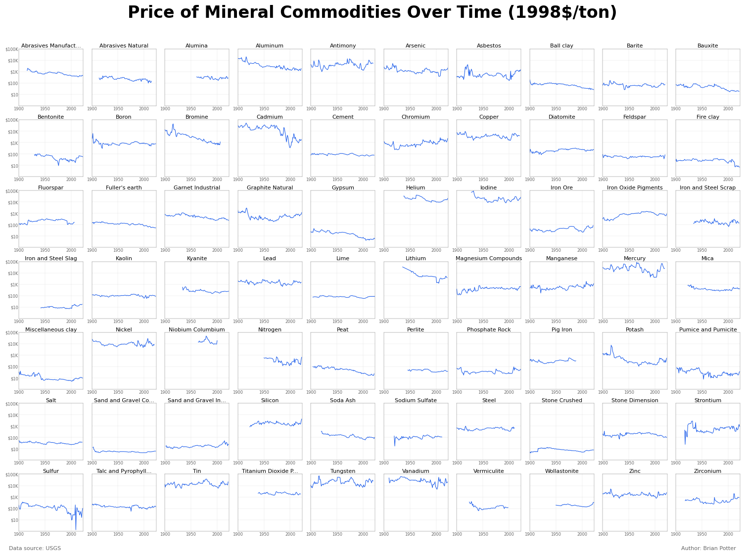
Now let’s look at minerals. The graphs below show the price of 93 different mineral commodities — industrial metals like aluminum and steel, precious metals like gold and platinum, chemicals like nitrogen and hydrogen, and various other minerals such as graphite, bentonite, gypsum.
And here’s high-value minerals:
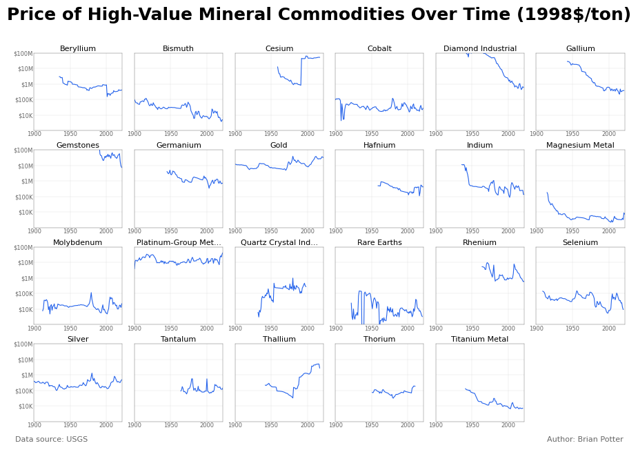
We see a range of different price trends here: some minerals (gold, platinum, molybdenum) have risen in price over time, while others (aluminum, gypsum, magnesium) have gotten cheaper. But at a high level, the trend is towards commodities getting cheaper over time. Of these 93 mineral commodities, 60 of them got cheaper between the beginning and end of their time series. In 36 of the 93, the price decline was greater than 50%, and in 10 of them the decline was greater than 90%.
As with agricultural commodities, this trend has gotten weaker recently. For the 75 commodities which have data over the 1990 to 2020 period, only 39 (slightly more than half of them) have gotten cheaper over that period; the other 36 have gotten more expensive.
So at a high level, historically most commodities were getting cheaper over time, but in recent decades this has been significantly less true. Beef, pork, oil, natural gas, copper, construction sand, and phosphate for fertilizer are all commodities that formerly were consistently falling in price but for the last several decades have been getting more expensive.
Another way to get a sense of what commodity price trends generally look like is to do something similar to the Simon-Erlich wager and look at aggregate price changes over particular windows of time. To do this, I divided the dataset for each commodity into 20-year chunks (starting from 1860), and calculated an equivalent annual rate of change over each window. So for iron ore, which has prices from 1900 through 2021, there would be six price windows: 1900 to 1919, 1920 to 1940, and so on. The price for iron ore was $47.45 per ton in 1900 and $33.02 in 1919, giving an equivalent annual change of about -2% for that window.1 This gave me over 600 different commodity price changes, which are shown on the histogram below:
Looking at all commodities together, we can see the overall tendency for prices to decline over 20-year periods of time, but plenty of periods where commodities rise in price. You can see this from the left-skew on the graph, indicating a greater tendency towards price declines than price rises. This tendency towards declining prices is true for each category of commodity except fossil fuels, which have a very slight tendency to rise in price over time.
However, if we just look at the most recent window of time, 2000 to 2020, we instead see a right-skew, a tendency towards rising prices:
Conclusion
To sum up: historically commodities have generally fallen in price over time, but recently this trend has increasingly shifted towards rising prices. Natural gas and oil got cheaper until the 1950s and the 1970s, respectively, and since then have gotten more expensive. Beef and pork both got cheaper from 1970 until the 1990s, and since then have risen in price. Agricultural products were almost uniformly falling in price until around 2000, and have almost uniformly risen in price since then.
My general sense looking at historical commodity price data is that the more that production of some commodity looks like manufacturing — produced by a repetitive process that can be steadily improved and automated, from a supply that can be scaled up in a relatively straightforward fashion, without being subject to severe depletion dynamics — the more you’ll tend to see prices fall over time. The biggest decline in price of any commodity I looked at is industrial diamonds, which fell in price by 99.9% between 1900 and 2021d ue to advances in lab-grown diamonds production. This effectively replaced mined diamonds with manufactured ones for industrial uses; roughly 99% of industrial diamonds today are synthetic. Many other commodities had major price declines that were the result of production process improvements — aluminum got cheaper thanks to the invention (and subsequent improvements) of the Hall-Heroult smelting process, titanium’s price declined following the introduction of the Kroll process, and so on. (Steel also got much cheaper following the introduction of the Bessemer process, but that predates USGS price data.) And of course agriculture, which has evolved from crops being harvested manually to being harvested with highly automated, continuous process machinery, closely mirrors the sorts of process improvements we see in manufacturing.
Of course, this trend alone can’t explain changes in commodity prices over time, and there are plenty of commodities — steel, cement, silicon — that are produced in a manufacturing-type operation but which haven’t seen substantially declining prices over their history. And even commodities which resemble manufactured goods have risen in price recently. More generally, there are plenty of things that can shift supply and demand curves to the right or left: cartels, national policies, a spike or collapse in demand, and so on. But the question of “how much, over time, does the production of this commodity resemble a manufacturing process?” seems like a useful lens on understanding the dynamics of commodity prices.
Because this calculation might depend on what the boundaries of the price window are, I did a sensitivity analysis by starting at a few different years and seeing how the outcome changed. Changing the window of time doesn’t change the results.
You really can't run this analysis treating energy prices as if they were just like any other commodity. Energy is one of the most significant inputs for all commodities. It's either required directly in production/extraction (e.g., operating machinery, running factories, powering smelters, etc.) or indirectly (e.g., transportation costs). It's a very major factor in agricultural prices, not only in obvious ways, but because taken together, fertilizers and pesticides all by themselves represent something like 3-5% of the world's total fossil fuel consumption annually. That's in addition to the energy costs of operating agricultural machinery and shipping agricultural products absurd distances for packaging, distribution, and retail sale.
Like the tiny jar of honey I saw in my office breakroom this week. The honey itself was produced in New Zealand, it was packaged in the UK, and sold in Pennsylvania. The total cost of the product I held in my hands was probably mostly energy. The actual honey was almost a rounding error.
So when you look at all these various commodities, particularly agricultural prices, you should really account for movements in energy prices, as they make everything more expensive, in and of themselves.
I'd be very interested to see an update to this analysis with such an adjustment.
The timing of the Ehrlich-Simon bet wasn’t random, it was at a time when prices had recently risen sharply. The debate was over whether this was due to exhaustion of resources (Erhlich’s argument) or just short term cyclical factors (Simon’s). Simon won the bet as of course supply of pretty much all commodities vastly increased and we didn’t all starve to death.
Importantly Simon didn’t ever say commodities would always decrease in price from any point, he was well aware of commodity cycles and trivializing the argument to this misses the point. The real lesson of this bet is the abundance one; we can rely on the power of the market to incentivize human innovation to increase supply. This contrasts with what superficially seems the more “sensible” doomster approach of government top down intervention and control but which has led to many disastrous and inhumane policies like Indian sterilization programs, or the Chinese one child policy.